Keeping Ethanol Labs 'Between the Lines'


October 4, 2020
BY Matt Thompson
Andrew Hawkins, director of laboratory services at Phibro Ethanol Performance Group, likens control charts to a two-lane highway. Drivers on a winding country or mountain road, he says, know they’re in their lane because they haven’t passed over the double-yellow center line or the white line marking the side of the road.
“The control chart is almost exactly like that,” Hawkins says. “It’s a statistical derivative or version of that. Where you’ve got the centerline, that’s the double-yellow line, and then you’ve got an upper control limit—which is three sigma—and you’ve got a lower control limit—which is minus three sigma.”
Control charts aren’t new. Hawkins says they were developed in the 1920s but came into wide use after World War II as manufacturing became more complex. They were particularly helpful during the space race, he adds. “NASA had tens of thousands of steps that had to be done, and they had to be done with great accuracy through a process,” he says. “That’s when statistical methods like the control chart where actually more widely adopted. They’re used to kind of visualize your data, which gives you kind of a quick overview of whether something is out of whack, in process or normal.”
While they’re not new, Hawkins says he isn’t sure how widely they’re used within the ethanol industry. But, he adds, there is interest among plant and lab managers about how the tools can help ethanol operations. Following a presentation he gave last fall, Hawkins says many of the questions were about control charts. “People were inquisitive about the tool and how it could help them,” he says.
Hawkins says control charts are useful for processes that are repeated. With 20 results in hand, control charts really become useful, he says. “They’re really a way to visualize process data that you’re doing repeatedly—things that you do every day or every so often,” he says. “It’s a way to visualize the results of a process or a machine and then be able to visually indicate when things are working as they should—or in control—or when you might have an excursion or a process upset, or an instrument upset.”
Advertisement
Knowing those upper and lower limits, and when plant machinery is operating within those limits, allows a plant to fine-tune its operations, Hawkins says. “By leveraging control charts, you can really find when things are in control, or hovering around that centerline where you would expect to be, and whether or not you have really wide limits, or really narrow limits,” he says. The result of that fine-tuning, he explains, is represented by data being closer to the center, or “hugging the centerline” in the road analogy.
In Check
Kristi Plack, chief science officer at Bion Analytical, says control charts are “a great way to monitor each instrument over time to see if you’re seeing any trends.” Repeated deviations from an instrument’s true value would require a deeper look to see where the issue lies, she says.
Hawkins agrees. “[Control charts are] a way to generate trends, and statistically, it’s a way to view the trends of your equipment so you know whether or not your pH meter or your HPLC is functioning,” he says.
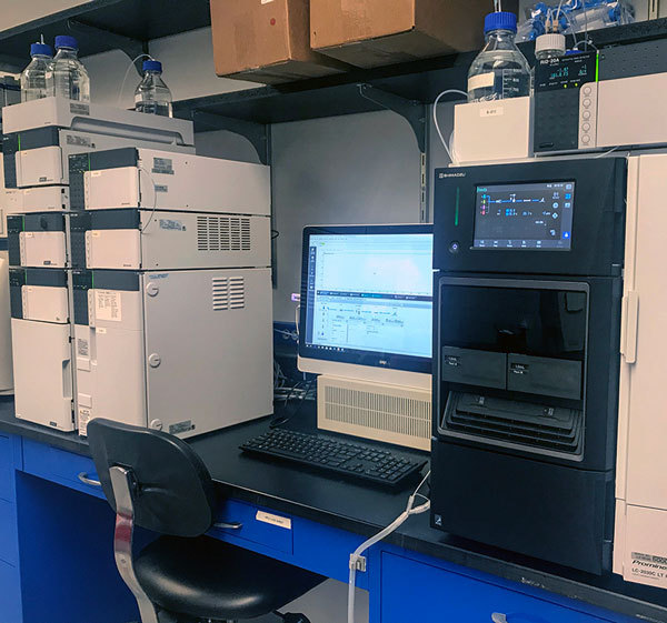
Control charts are also useful for visualizing natural variability in lab data, Hawkins says. “There could be a hundred different reasons why, when you run a sample on the HPLC today, it reads 1.05, and when you run it again tomorrow it reads 1.01,” he says. “But the question is are those two numbers within the expected natural variability or do they indicate that the machine wasn’t working yesterday or maybe it isn’t working today. And so, it kind of allows you to appreciate that and put those results in context.”
And while control charts are a statistical tool, which may seem daunting to some, Hawkins says they can be used without understanding the math behind the results. He explains that software programs and templates like those made by the American Society for Quality, and others, don’t require users to derive the equations to use the tool. “You don’t need to know the theory behind the power drill, you just need to know how to work the power drill,” Hawkins says, adding that he doesn’t have a background in statistics but makes regular use of control charts.
Advertisement
Keeping the charts easy to use is important, according to Plack. “I would make sure that it’s something that’s not burdensome to someone, because we all know what happens there, right? You end up not using them,” she says.
Hawkins agrees. He says it’s possible to generate control charts by hand, but he doesn’t recommend that method. “You can actually learn how to generate them without deriving the equations,” he says, adding that a program called JMP is one option, as is Excel.
“It’s not hard to do in Excel, which everybody has on their computer,” Plack says. “It’s just making one, and then once you have one made, you can tweak it for the next one.”
Fine-Tuning
As plants make more incremental changes to efficiency and operations, control charts can help guide those changes. “I think more and more people are realizing—especially as margins become tighter—that you have to dial in your process; you have to have a very well-controlled, predictable process,” Hawkins says.
Plack agrees. “It’s showing variability over time, and you would think the more that you watch that, you could hone it in and so those upper and lower control limits could get tighter and tighter as you get better,” she says. “We calculate our 95 percent confidence interval and update our control limits annually so we can see, historically, how tight those control charts have gotten. So you’re watching it so much more minutely because you’ve tightened how well you run your instruments and how well your technicians work,” Plack says.
Outside the Lab
Hawkins’ presentation at the 2020 International Fuel Ethanol Workshop & Expo in September focused on control charts as a way to make sure lab equipment is functioning properly. But, he adds, control charts can be useful in other areas, too. “Ethanol laboratories are not the only place where data is collected and analyzed to determine how the process is running,” he says. “That’s also something that’s done in the control room. … It complements doing trends in a DCS, because it’s a way to check your instruments. You can actually use it for the whole process. You could make control charts for the temperature on ferm 2 if you really wanted to.”
Hank Britton, director of optimization and advanced control for OpX Control Inc., agrees that control charts are valuable outside the lab. Briton, whose work with ethanol plants involves programming PID control loops and continuous process control, says control charts can be used in process control for things like measuring fermenter temperatures. “You could plot temperature at a specific time for multiple batches,” he says. He adds that one of his customers did this as a way to see how fermenters were operating. They plotted fermenter temperatures at 12, 18 and 24 hours for different batches. “[They] looked at snapshots for multiple fermentation batches before I did work and then multiple fermentation batches after I did my work,” he says. “You could plot temperature at specific times for those batches to see an improvement.”
He also says plotting dryer temperature could be helpful. He said a customer recently complained his dryer was not controlling well. “when I looked at the average absolute error, the absolute value of the deviation from the setpoint as a function of time, it went up from like a 0.22 to a 0.69,” Britton says. “That increase in an average absolute error indicated to me that something changed in the process.”
However, control charts remain most impactful in the lab. And Plack recommends plants use them. “I would highly recommend the use of control charts in the laboratory for all aspects; all tests that they run,” she says. “The big thing is you don’t know what you don’t know. So you really need to watch all of these things because a little bit of a change in an instrument could affect all kinds of operational changes, and then you find out it was because an instrument was not tight enough and that could mean a lot of money to the plant.”
Author: Matt Thompson
Freelance Writer
mthompson@bbiinternational.com
Upcoming Events